Product · SaaS
A SaaS analytics dashboard that turns raw numbers into decisions.
Project overview
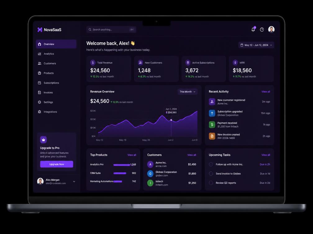
A B2B analytics product where teams track revenue, customers and subscriptions. The challenge was density: showing a lot of data without overwhelming the person reading it.
My role
- Product design
- Data visualisation
- Design system
- Prototyping
Problem statement
Teams exported data into spreadsheets because the product never answered their questions directly.
Goal
Surface the handful of numbers that change decisions, and make everything else one click away.
Key metrics
4
core metrics on the overview
12
reusable chart and card patterns
1
dark theme built for long sessions
Designing for density
A strict grid, a single accent colour and one type scale keep a page full of numbers calm. Everything secondary is muted so the primary figures read first.
Components, not screens
The dashboard is assembled from a small set of cards, charts and list rows, so new views can ship without new design work.