Web app · Fintech
Designing a fintech platform for Gen Z users to manage digital payments & their investments.
Project overview
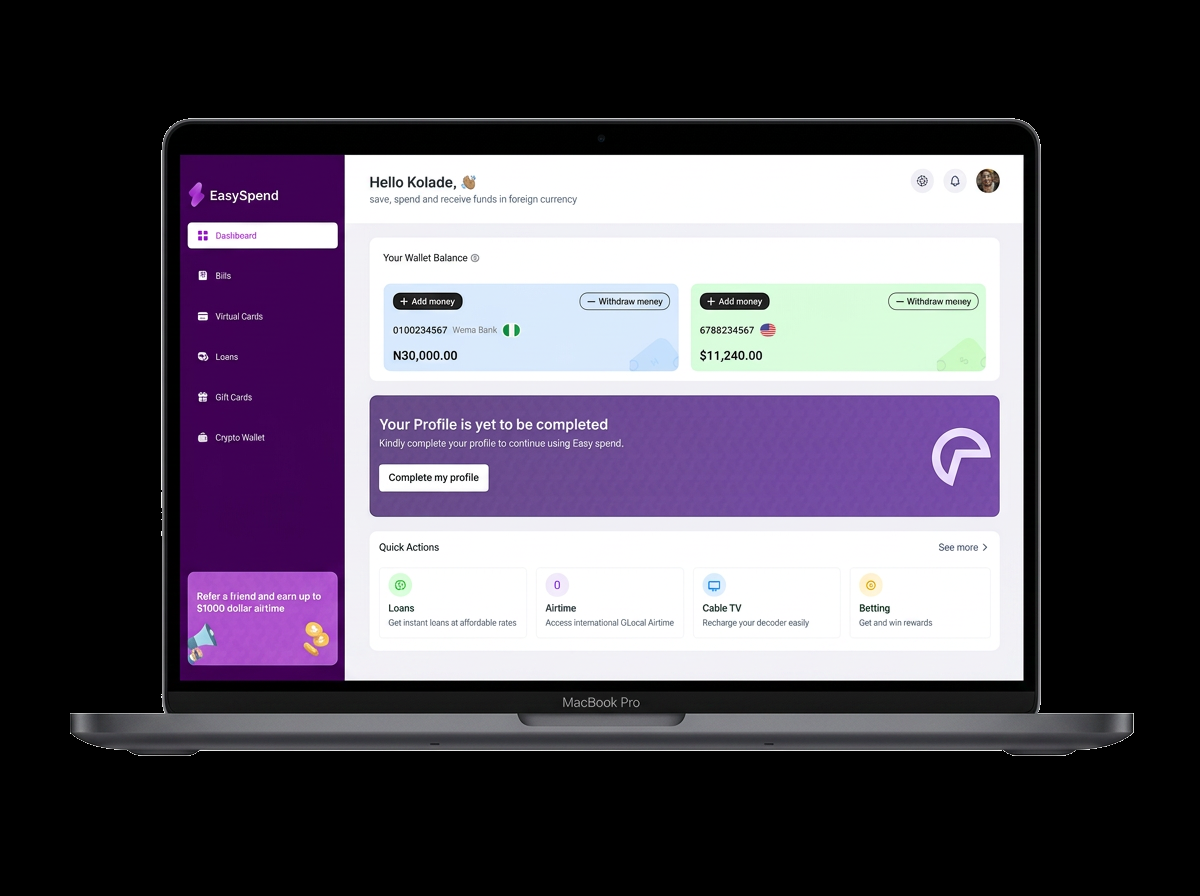
EasySpend is a fintech platform that lets users save, spend and receive funds in foreign currency, with instant loans, airtime, cable TV, betting and crypto wallet features — all from one intuitive dashboard.
My role
- User research and competitive analysis
- Product analysis and information architecture
- Interaction and visual design
- Prototyping and usability testing
Problem statement
Gen Z users juggle multiple payment apps, investment platforms and budgeting tools with no single view of their money, making it hard to track spending or build consistent saving habits.
Goal
Bring payments, budgeting and investing into one clean, friendly app that turns money management into a daily habit Gen Z actually enjoys.
Key metrics
6
core screens designed end to end
3
user testing sessions run remotely
1
unified dashboard for payments & investing
Research & analysis
I interviewed Gen Z users about how they handle money day to day and where existing apps fall short.
- Most use three or more apps just to move money around.
- Spending insights are buried behind menus, so habits go unchecked.
- Investing feels intimidating — they want guidance, not jargon.
Product analysis
Mapping the competitive landscape revealed a gap: no app spoke to Gen Z in their language or brought payments and investing together. EasySpend's value proposition centred on one dashboard for everything, with friendly nudges instead of cold dashboards.
Design process
I designed the dashboard, wallet, virtual cards, loans and quick actions screens around a single visual language — deep purple as the brand anchor with pastel wallet cards for warmth. The sidebar groups every feature under one roof so users always know where they are.
User testing
Remote moderated testing sessions validated the core flows and surfaced quick wins: a clearer onboarding sequence, a condensed mobile dashboard with bottom navigation, and more prominent savings goal progress.
Results
The final design gives Gen Z a single place to spend, save and invest without context-switching. The friendly visual language and real-time insights make money management feel approachable rather than overwhelming.
Challenges faced
Balancing density with clarity was the biggest challenge — the dashboard surfaces a lot of data, so I relied on a strict card system, generous whitespace and a muted secondary palette to keep the primary figures readable.